Overview
In the age of surveillance capitalism, the most valuable data grows in the shadows. Blind Spot is a critical design website that translates 12 concepts from Shoshana Zuboff’s The Age of Surveillance Capitalism (2018) into a digital experience — making visible what was designed to be invisible: the system of extraction, prediction, and behavioural control that underpins the internet we use every day.
The visual identity departs from absence: black background, red typography, maximum contrast. The site was built in Framer, with a navigation architecture designed to mirror the argument of the book itself.
A website that makes you perform the same act of unknowing it documents — revealing hidden meaning only when you decide to look.
① The Book
Shoshana Zuboff, 2018
The Age of Surveillance Capitalism is Zuboff’s account of how the digital economy transformed human experience into raw material — a commodity to be predicted, packaged, and sold. The book names 12 core mechanisms through which this system operates: from Behavioral Surplus to Big Other.
These are not abstract concepts. They describe the infrastructure behind every search, every click, every moment of hesitation recorded on a screen. Zuboff’s argument is that most people have never been told the names for what is happening to them — and that naming is the first step toward resistance.
② The Interaction
To see without being seen.
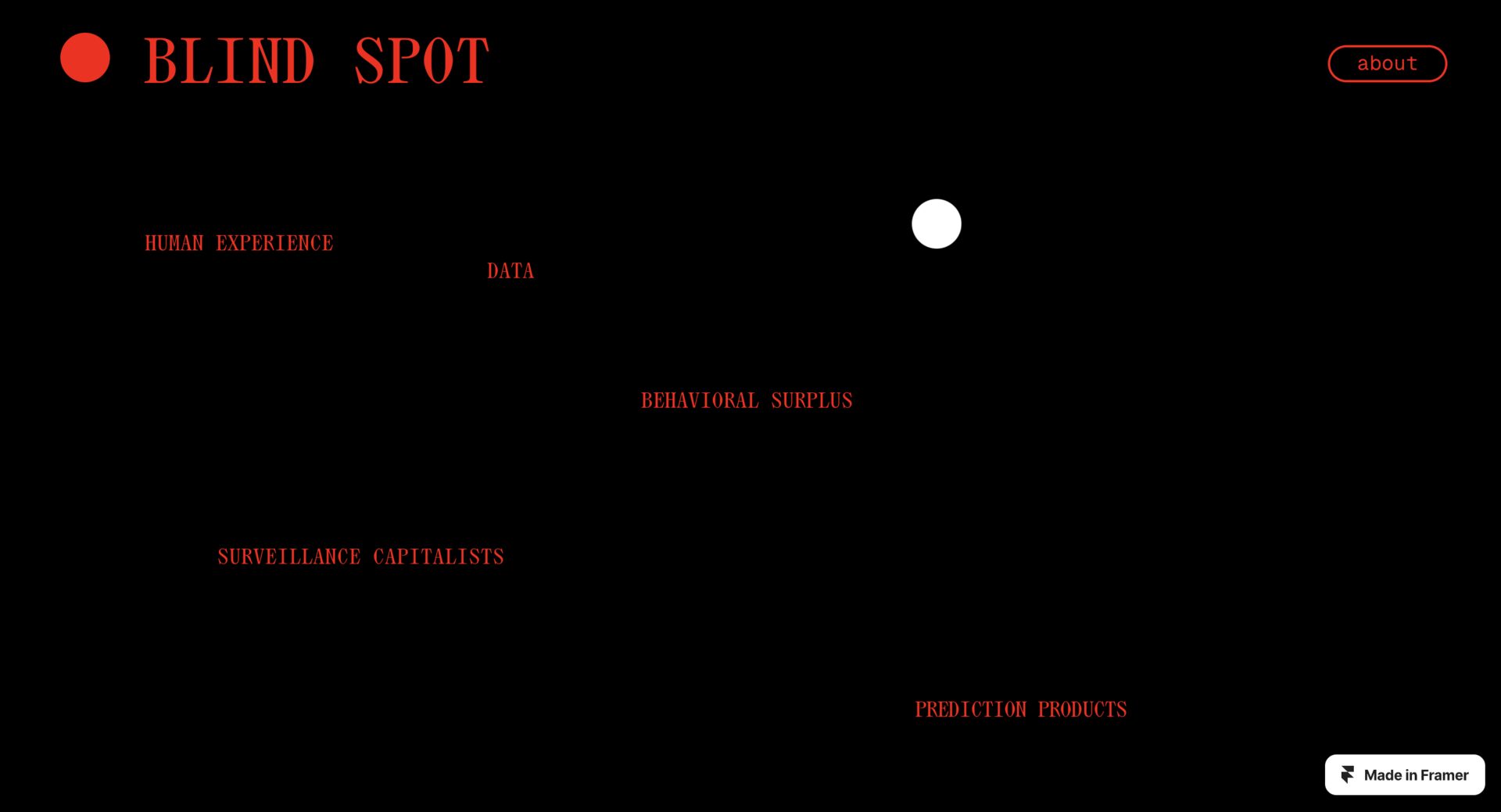
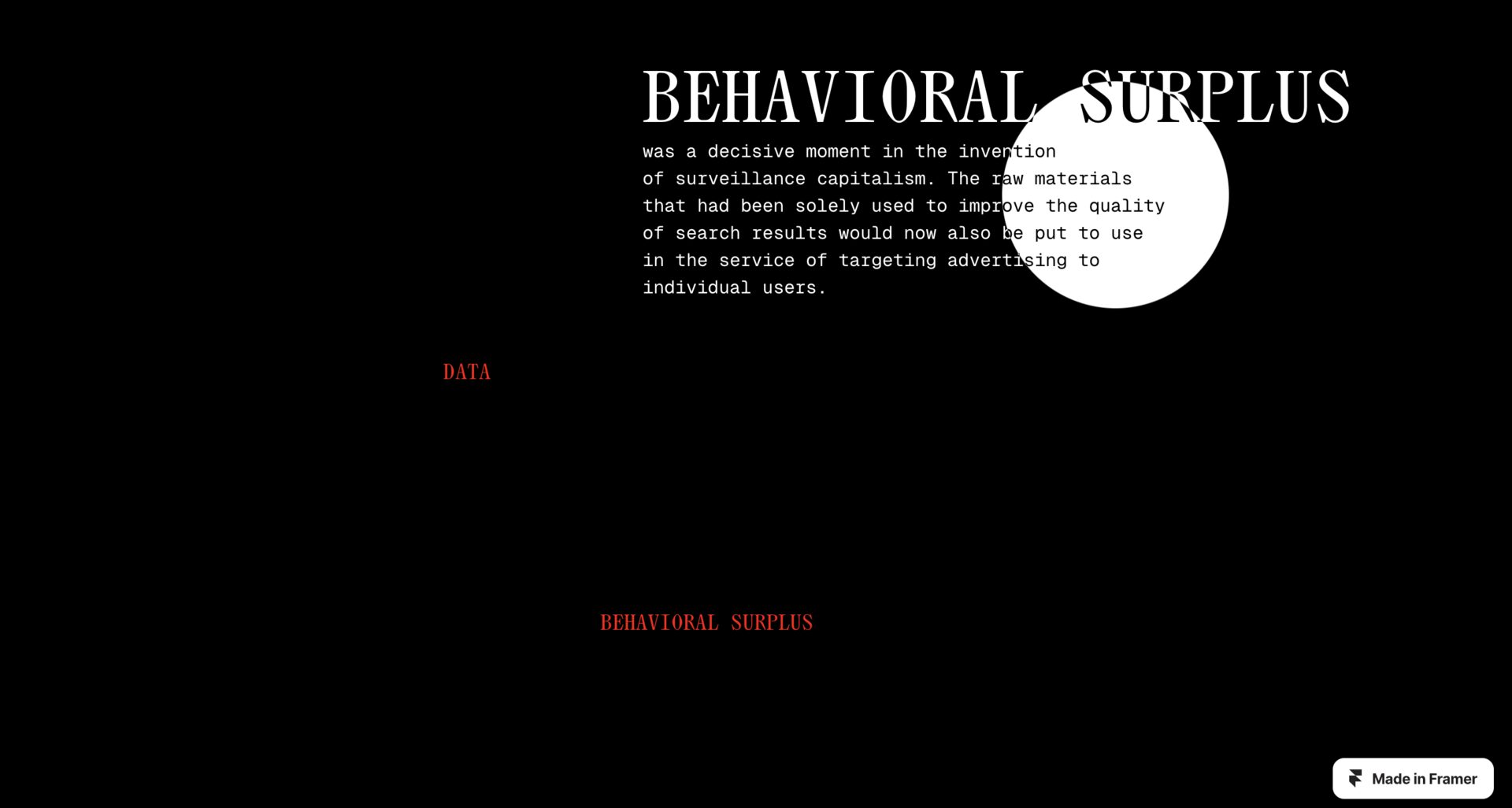
The central interaction decision mirrors the argument of the book. The titles of the 12 concepts are visible from the start — in red, against black — but their meaning and Zuboff’s excerpts only appear when the user hovers over them.
The content exists. It is visible. But it remains opaque until someone decides to look — exactly like the data extraction mechanisms the site documents.
The internal debate
The hover effect raised a real design question: was the friction a usability problem or a conceptual decision? We kept it. The difficulty of accessing meaning is part of the experience.
Multiply blend mode
The excerpt text already sat on the page and simply changed colour on hover. It felt like a colour trick rather than an act of uncovering, so we dropped it.
Fake distractions
A fake cookie banner and a “be careful” warning, added as pure noise mimicking real surveillance interfaces. Left out of the final site — the hover-reveal carried the argument on its own.
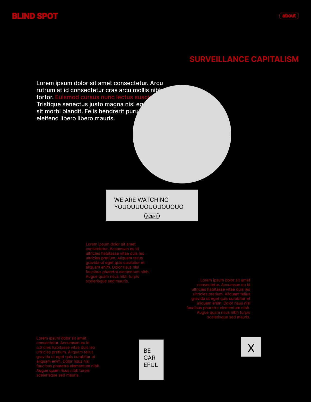
The friction is the argument: making the content harder to reach mirrors what it feels like to live inside surveillance capitalism. Usability and conceptual integrity pulled in opposite directions here, and we chose the concept.
③ My Contribution
Building the site in Framer
In this group project, I was responsible for the full technical construction of the site in Framer: implementing the hover reveal interaction, building the navigation architecture between the 12 interconnected concepts, and designing the full interaction logic.
④ Reflections
Blind Spot was the first project where I had to resolve a genuine conflict between design clarity and design argument. Every interaction design principle points toward reducing friction. Here, friction was the point.
The project also introduced me to critical design as a practice. The idea that a website can be an argument — that the way it behaves can carry a claim about the world, not just display information — is something I’ve carried into every web project since.
Explore how the site behaves on mobile — the hover mechanic is entirely inaccessible on touch screens, which creates an irony the project probably doesn’t intend.
© ellen damazio, 2026 — designed & coded