Overview
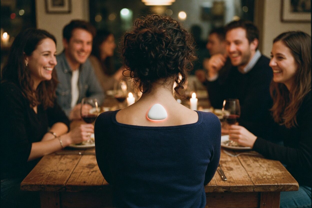
Ting is a hybrid wearable-app ecosystem designed to restore the intimacy of real-world encounters. Worn on the upper spine, close to the vagus nerve, the device vibrates subtly whenever it senses an emotionally compatible user nearby, based on physiological signals that an adaptive AI has learned to read. There are no swipes to make, no profiles to curate, and no photo galleries to browse through, because the body itself becomes the interface.
Developed for the Interaction Design course at FBAUL, Ting was grounded in Polyvagal Theory and affective computing, and shaped by a mixed-methods research phase with 93 participants, all pointing toward the same proposal: a shift away from performative digital socialising and toward presence, embodiment, and emotional resonance.
The Brief
Ting was developed for RETHINK IxDESIGN, the Interaction Design studio brief at FBAUL, a project grounded in posthumanist design theory that was explicitly critical of techno-determinism. The brief asked each group to design something that involved AI while ruling out the most obvious answer, a chatbot, which meant the easy route was closed off from day one.
It also required an explicit ethical stance on inclusion, accessibility, sustainability, and universal design, built into the process from the start rather than added on at the end. Together, these two constraints shaped Ting long before the wearable had a form or the app had a single screen.
AI, but not a chatbot. That single restriction ruled out the easiest path and pushed the team toward a harder question: what does an AI-mediated social interaction look like when there’s no conversational interface at all?
The Problem
Despite being the most digitally connected generation in history, Gen Z is paradoxically the loneliest. Raised in an environment of constant online presence, these individuals navigate relationships through screens, algorithms, and curated personas, yet often fail to experience authentic human closeness, since the ease of swiping has quietly replaced the harder, more rewarding challenge of real-life engagement.
Feel lonely frequently
Gen Z respondents report frequent feelings of loneliness, the highest rate of any generation. Cigna, 2020.
Social needs unmet
More than half have unmet social needs despite being always online. McKinsey, 2023.
Abandon social apps
Abandon dating or friendship apps because interactions feel artificial or forced. Survey, 2025.
Social apps promise connection but often deliver performance, comparison, and overload instead, and the psychological cost of that trade is high, showing up as increased anxiety, poor emotional regulation, and a growing sense of inadequacy. The real problem was never a lack of technology, but the absence of a safe emotional space in which to connect.
① Research
Theoretical Foundations
The project is grounded in two pillars: affective neuroscience and a critical analysis of how technology shapes human relationships. The central theoretical framework is Polyvagal Theory, proposed by neuroscientist Stephen Porges (1995), which explains how the vagus nerve regulates emotional states and social engagement through physiological feedback loops.
Ting applies this idea directly. Worn on the upper spine, the device activates that same safety-detection system through a subtle vibration, long before a single word is spoken.
User Research — Survey
To ground the project in real user needs, we ran a mixed-methods survey with 93 participants, most of them aged 18 to 25 and 83% of them students or student-workers. A significant majority reported experiencing social anxiety, particularly when it came to initiating in-person interactions, even though they were clearly interested in deeper, value-driven, real-world connections.
Two findings shaped the direction of the project. Nearly half the respondents, 46%, said they struggled to start and maintain conversations, and 41% found it hard to build meaningful long-term connections. At the same time, 51% named deep friendship as the type of connection they wanted most, rather than casual encounters or romantic matches, which pointed to a gap that existing platforms weren’t filling: the need for a low-pressure, authentic way to start.
Benchmarking
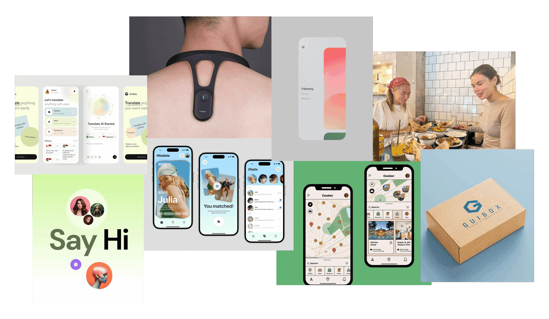
Ting was designed in dialogue with a range of existing tools, each one revealing a gap that the project set out to fill.
- Bond Touch & Neosensory Buzz Use vibration to simulate presence, but assume a pre-existing relationship.
- Replika AI & Limitless Pendant Advance affective computing, but stay screen-bound and productivity-driven.
- Tinder, Hinge & Bumble BFF Rely on swipe mechanics and visual-first judgment, exactly what Ting was designed to move away from.
- Life360 Its spatial model informed Match Tracking, but stays focused on existing groups.
The gap was clear. No existing tool combined embodied interaction, emotional AI, and real-world social initiation without leaning on a visual interface.
Personas
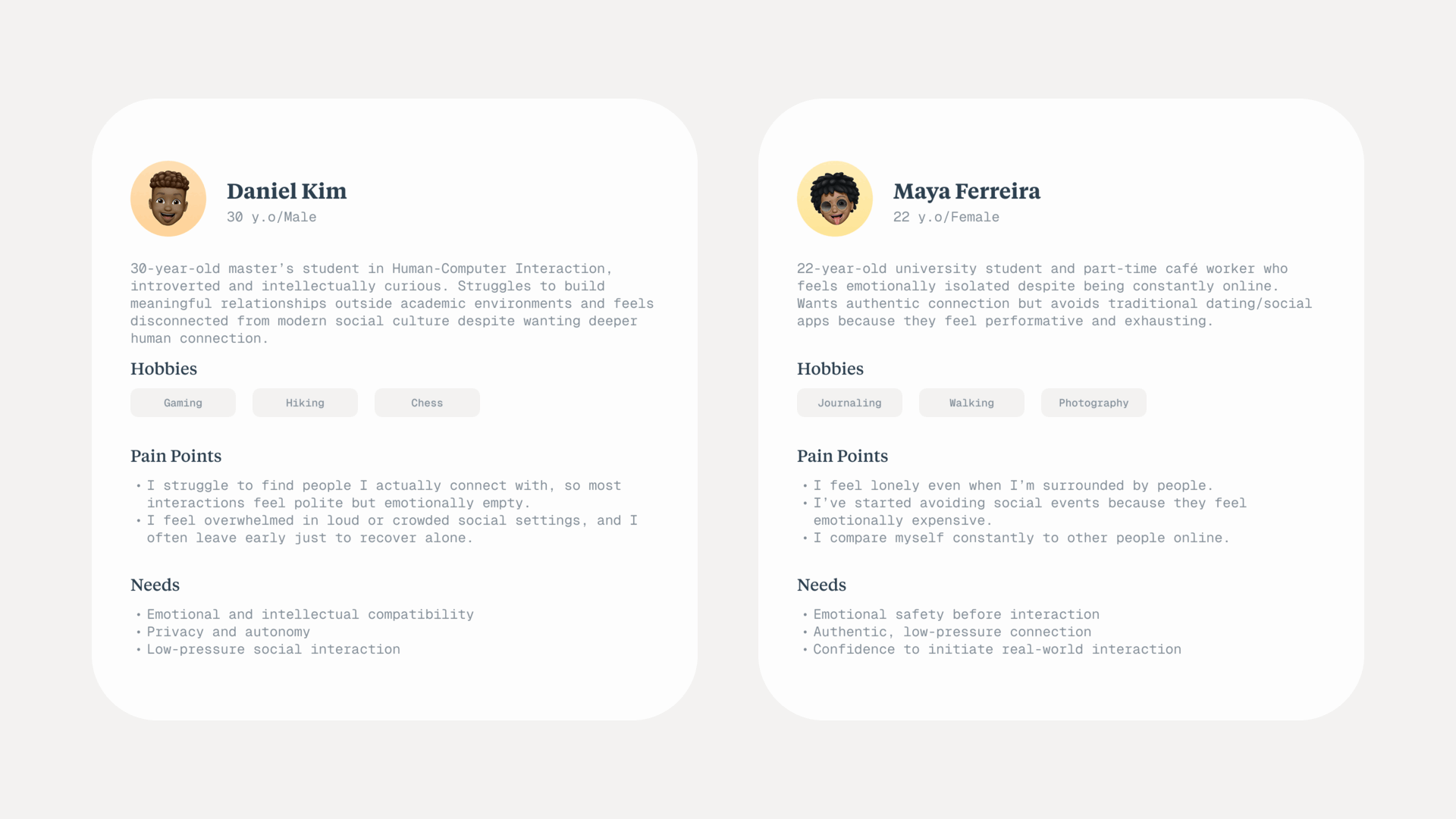
From the survey data, three user profiles emerged, and together they shaped almost every UX decision that followed: introverted young adults looking for non-verbal social cues, users trying to balance emotional vulnerability with self-protection, and people who crave genuine connection but need time and subtlety to build it. All three share the same core need, which is a way to initiate connection that doesn’t begin with performance.
② Ideation & Iteration
Exploring the wearable’s form
Before landing on the upper spine, the team debated several conventional wearable formats, and each one was rejected for the same underlying reason. A shape too familiar for wearable tech makes it too easy to spot who is “using Ting” in a crowd, which is the opposite of the discretion the concept needed.
Bracelet
Too recognisable as a wearable-tech accessory, instantly readable as “this person has a device on,” which undermines the discretion Ting depends on.
Glasses
Risked becoming a barrier rather than a bridge, since something worn on the face changes how people read attention and expression during the interaction itself.
Ring
Didn’t offer enough placement flexibility for the sensors the concept needed, and read as jewellery rather than as a discreet signal.
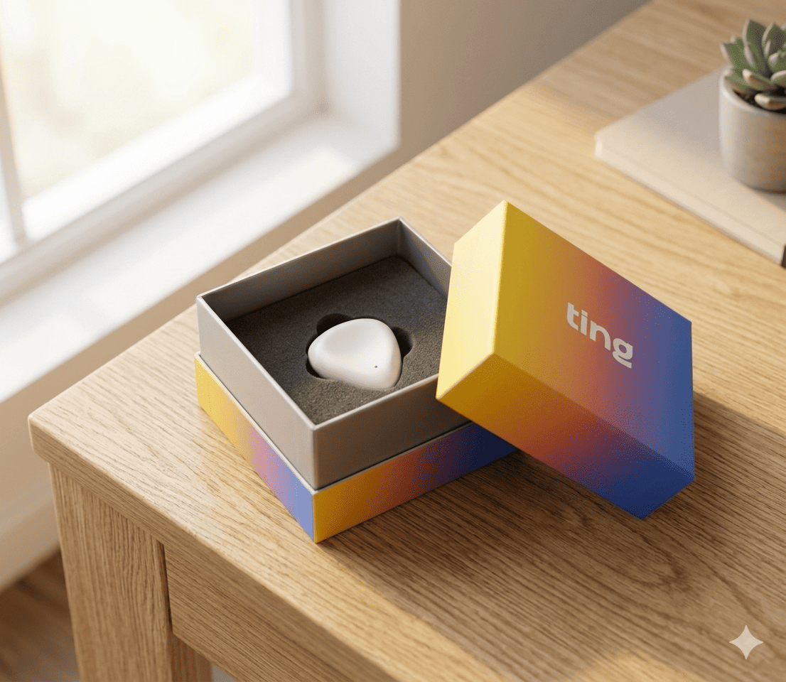
A conversation with our professor shifted the direction entirely, when he pointed out that the vagus nerve, which regulates the body’s sense of safety and social engagement, runs along the upper spine. Once that became the reference point, the form factor stopped being a styling decision and became a physiological one, and it solved the crowd-visibility problem at the same time, since worn under clothing near the collar, it doesn’t read as a wearable at all.
Defining the app’s role
With the wearable settled, the team pushed back on giving the app too much weight. If Ting’s core interaction happened inside a screen, it would just be another social app with a novelty gimmick attached, rather than the paradigm shift the brief was asking for.
Before designing a single screen, the team set one rule: the app supports the interaction, but it never becomes the interaction itself. Its job is to build the user’s profile, feed the personal AI model that reads compatibility, guide the user toward a match, and hold everything else, such as preferences, history, and settings, that doesn’t belong in the moment of the encounter itself.
③ Solution
How it works
Ting is a hybrid system composed of two elements: a small wearable device placed on the upper spine, and a complementary mobile app. The wearable acts as a real-time emotional radar, while the app functions as a private affective log rather than a social feed.
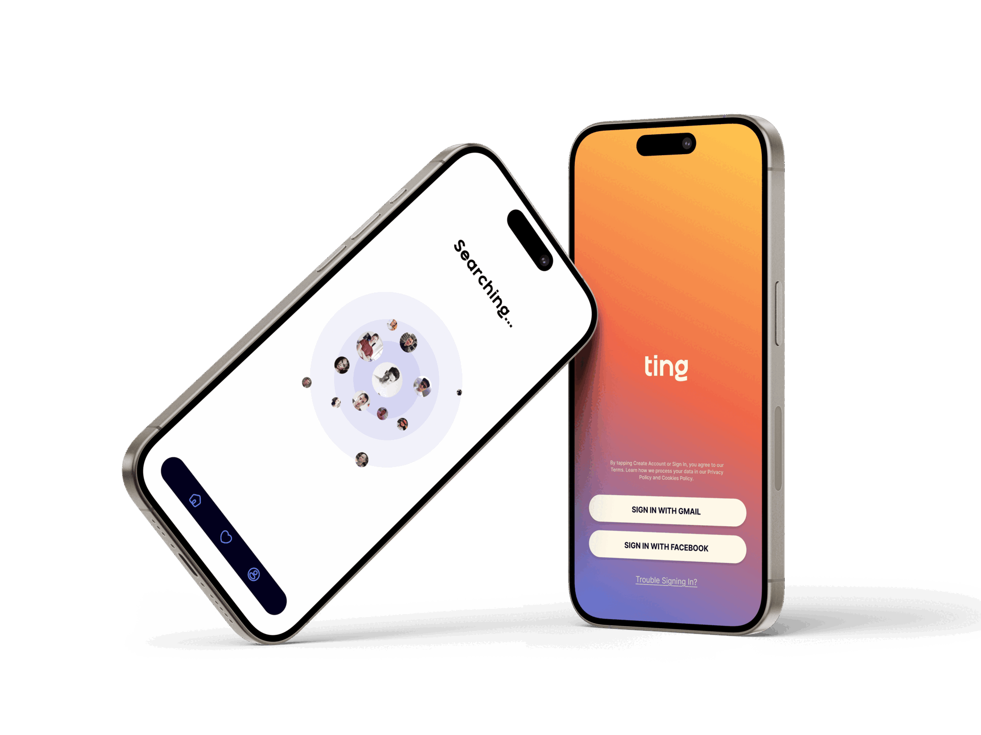
After account creation, the user completes a brief personality questionnaire to train their personal AI. The wearable then collects biometric data in real time and compares affective profiles whenever another Ting user is nearby. If compatibility is detected, both devices vibrate gently, discreet enough not to demand action yet distinct enough to spark curiosity, and a pop-up then appears in the app inviting the user to decide whether to meet.
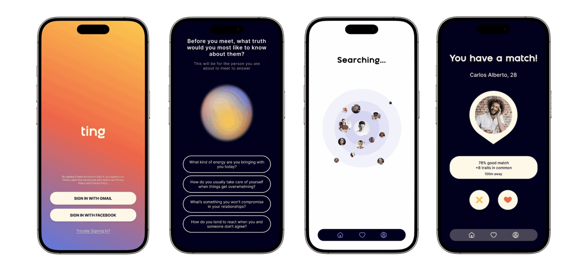
If accepted, the app opens a map view showing the other user’s approximate location, allowing a spontaneous, real-world encounter. If declined, life continues. No obligation, no notification history, no digital footprint of the interaction.
Low input, high resonance. The app is a reflection tool; the wearable is the emotional radar. The most important interaction is the one that happens without the screen in the way.
Visual Identity
The name Ting captures that first moment, the soft vibration and the almost imperceptible cue that something meaningful is near. It doesn’t explain anything. It simply signals.
The brand gradient moves from deep blue through lilac, coral, and soft orange to warm yellow. The colour system is drawn from emotional thermography and the structure of Paul Ekman’s Atlas of Emotions. Blue evokes regulation and calm; orange and coral suggest emotional activation; yellow signals openness and curiosity. Together, they reflect the full spectrum of what the body might feel when real connection is near.

④ Design Process
Interaction model & UX flow
The interaction model is intentionally minimalist. The app serves three functions only: reviewing emotional “highlight” moments from past interactions, adjusting preferences and boundary settings, and viewing a map-style history of meaningful encounters. The interface deliberately avoids all the dynamics of traditional social apps, with no feeds, no messages, and no photo browsing.
- 1Account creation
- 2Onboarding (AI calibration)
- 3Wearable searches nearby
- 4Vibration signal
- 5Match notification
- 6Optional map view
- 7Physical encounter
- 8Interaction Summary (Ting Score)
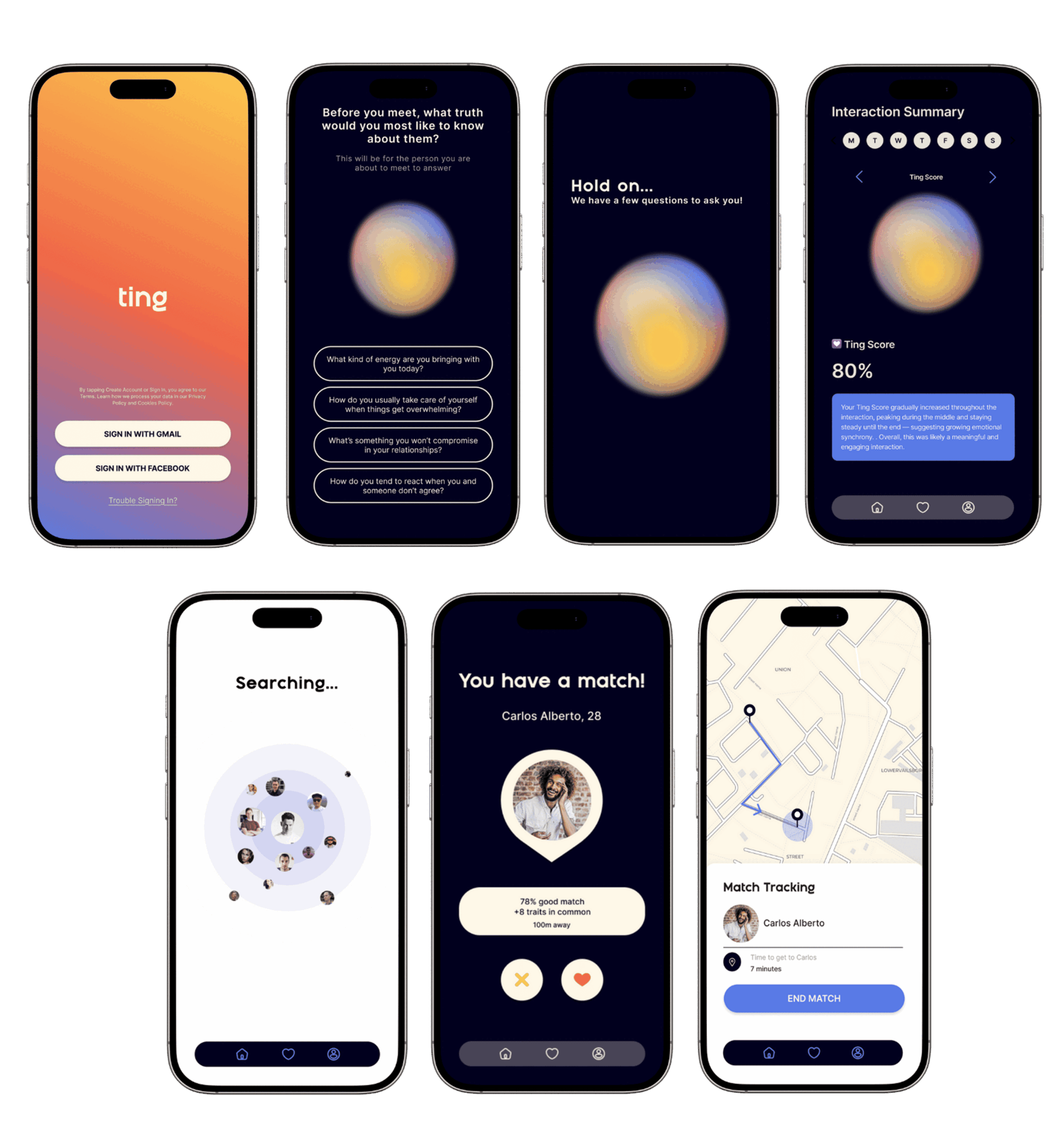
Post-interaction prompts, such as asking “What kind of energy are you bringing today?”, support emotional self-awareness and help refine the AI model over time.
Prototyping & User Testing
In the final phase, Ting was brought to high fidelity through detailed UI mockups for the mobile app and physical prototyping of the wearable device. An informal testing session with participants aged 18 to 25 then assessed the onboarding flow, the intuitiveness of the interface, and how people responded emotionally to a simulated match event using a gentle vibration.
Feedback was overwhelmingly positive. The absence of swipes, profile images, and flashy buttons was consistently noted as calming and different, and participants described the experience as fluid, intuitive, and more human. The main refinement participants asked for was clearer onboarding, so that the meaning of the vibration is established early and there is no confusion about what a match signal actually means.
It felt futuristic, but not invasive. Once the concerns around AI settle down and something like this becomes real, I’d use it — and it’s discreet exactly because of where it’s worn.
— Testing participant, informal session (18–25 age group)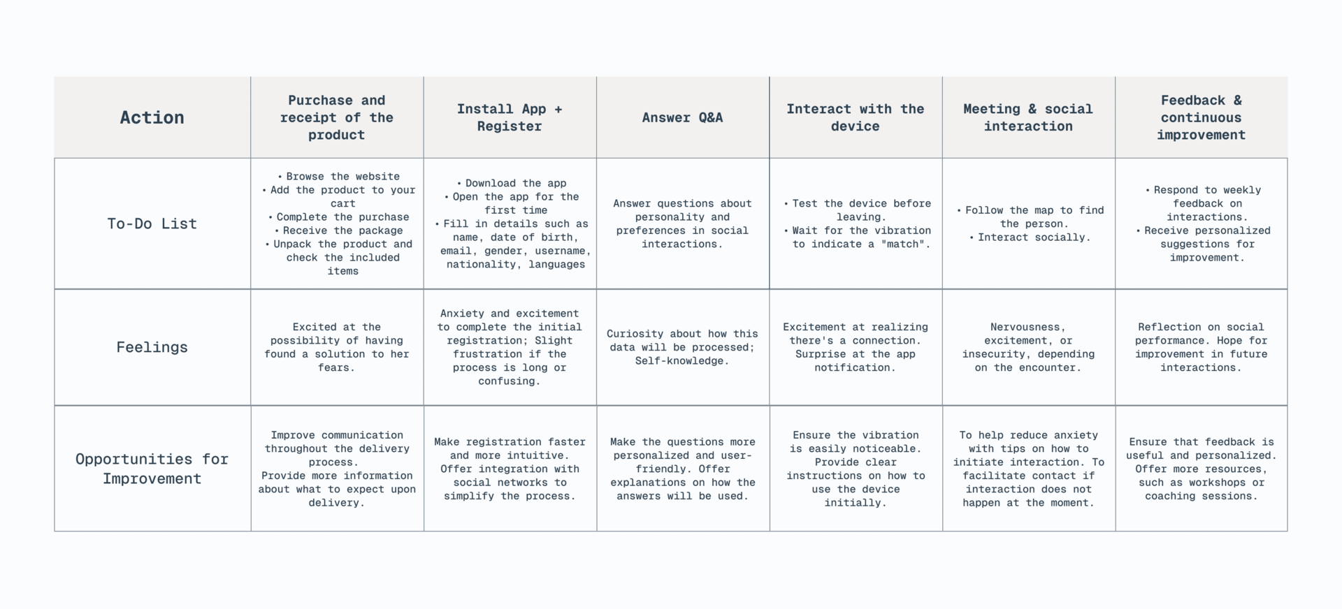
⑤ Edge Cases
The course brief required more than a working prototype. It also asked for an explicit ethical stance on inclusion, accessibility, and universal design, and for Ting, most of that reflection centred on two moments where the system could easily have caused harm if left unexamined.
Meeting a stranger safely
A vibration match doesn’t guarantee that the person who shows up is the one the system intended. Users can cancel the match from a safe distance before any real-world encounter happens, and the single photo shown at match time exists specifically so people can confirm they are approaching the right person before the interaction becomes physical.
Reintroducing the beauty standard we tried to remove
A full photo gallery would have quietly brought back the same appearance-first judgment that dating apps are often criticised for, which is exactly what Ting was designed to avoid. The compromise was to show a single photo, and only at the moment of a match, used strictly for safety confirmation rather than for browsing, comparing, or swiping.
⑥ Key Outcomes
⑦ Takeaways
Ting pushed me into territory I hadn’t expected: designing not for engagement, but for its absence. The interaction that matters most in this system is the one that happens away from any screen, and that required a fundamental inversion of how UX is usually framed. Instead of asking how to keep users inside the interface, we had to ask how to get them out of it as quickly as possible.
Applying Polyvagal Theory to UX design taught me that the body is an interface in its own right, and that the most effective design sometimes means stepping back entirely and letting human connection come forward. It also demanded a rigorous ethical balance between collecting sensitive physiological data and keeping the experience protective rather than extractive, a balance I explore in more depth under Edge Cases above.
This project changed how I think about the role of technology in social contexts. The question stopped being how to make connections faster, and became how to make them safer. That shift in perspective is something I carry into every interaction design problem I approach now.
Run structured usability testing, not just informal sessions, with a protocol focused specifically on the meaning and readability of the haptic language. The vibration is Ting’s most critical design element and it deserves dedicated testing beyond the onboarding flow. I would also explore accessibility from the very start, asking what Ting means for users who experience touch or vibration differently.
Lifestyle and concept imagery generated with Grok and Gemini. All UI mockups, prototypes, and screens designed by me in Adobe Photoshop and Figma.
© ellen damazio, 2026 — designed & coded